
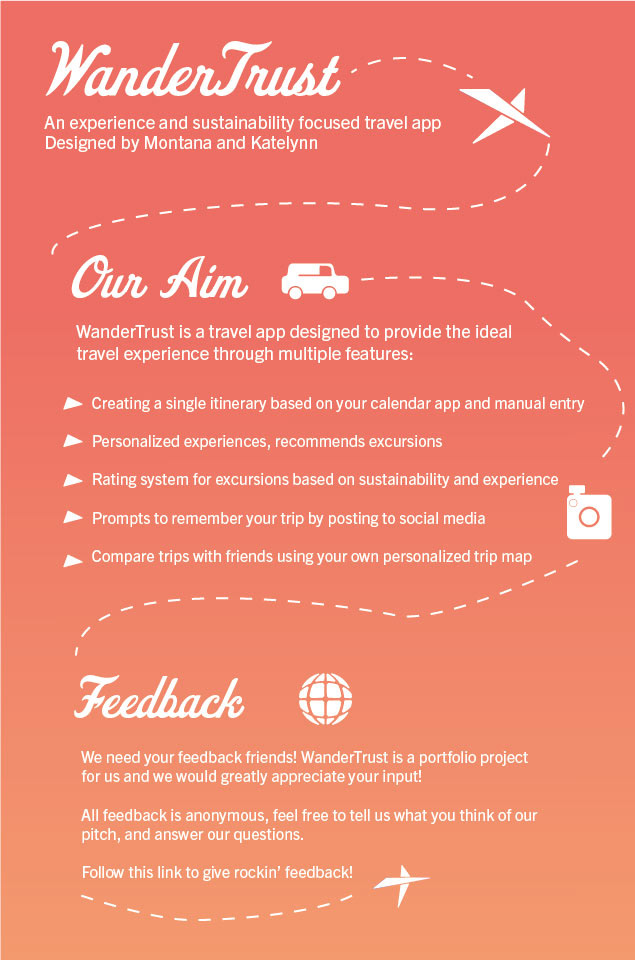
WanderTrust was an idea I had for an app to organize your travel
I brought this to my friend and we made it a fully fledged UX project. Montana started the market research while I started branding and design.
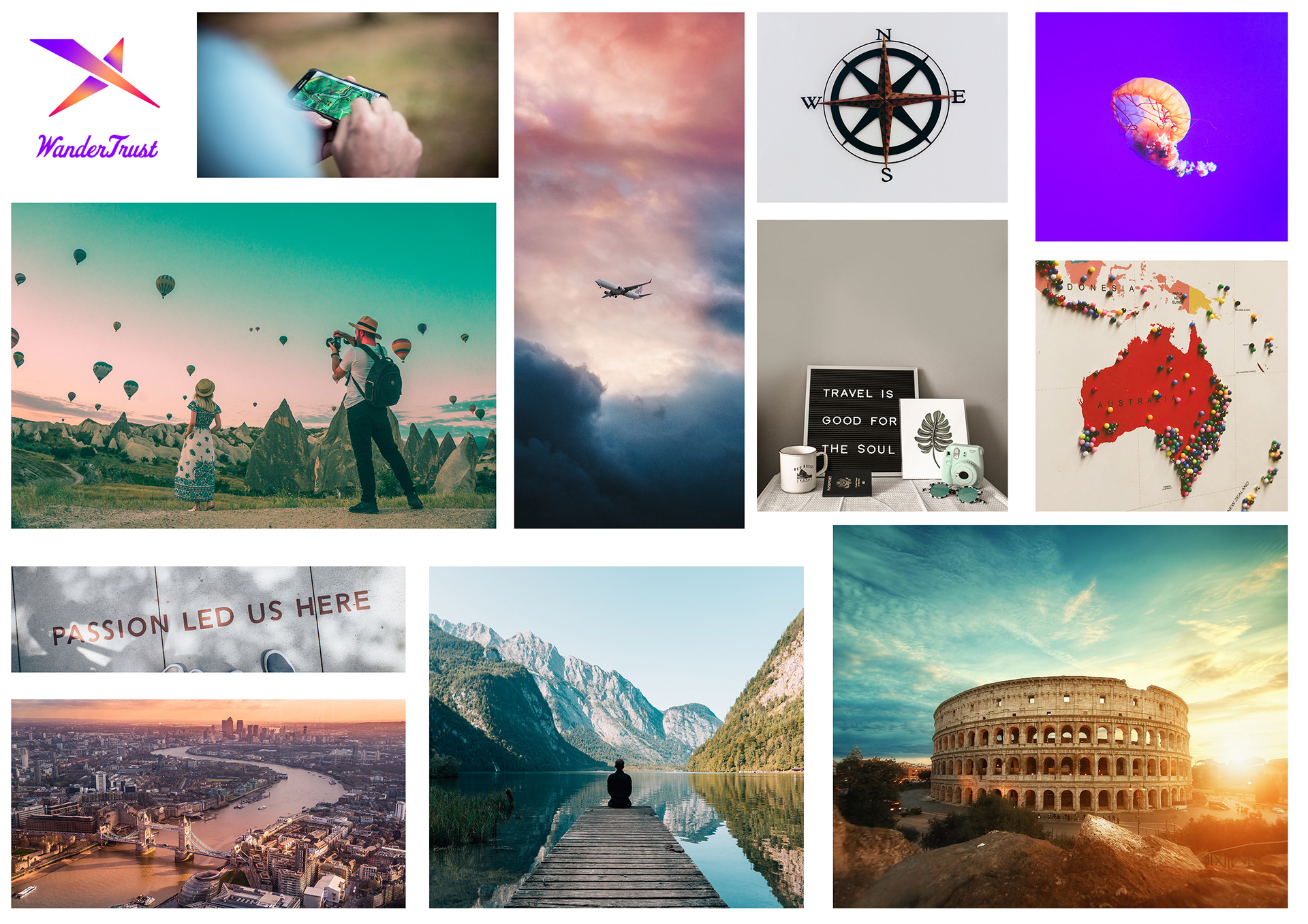
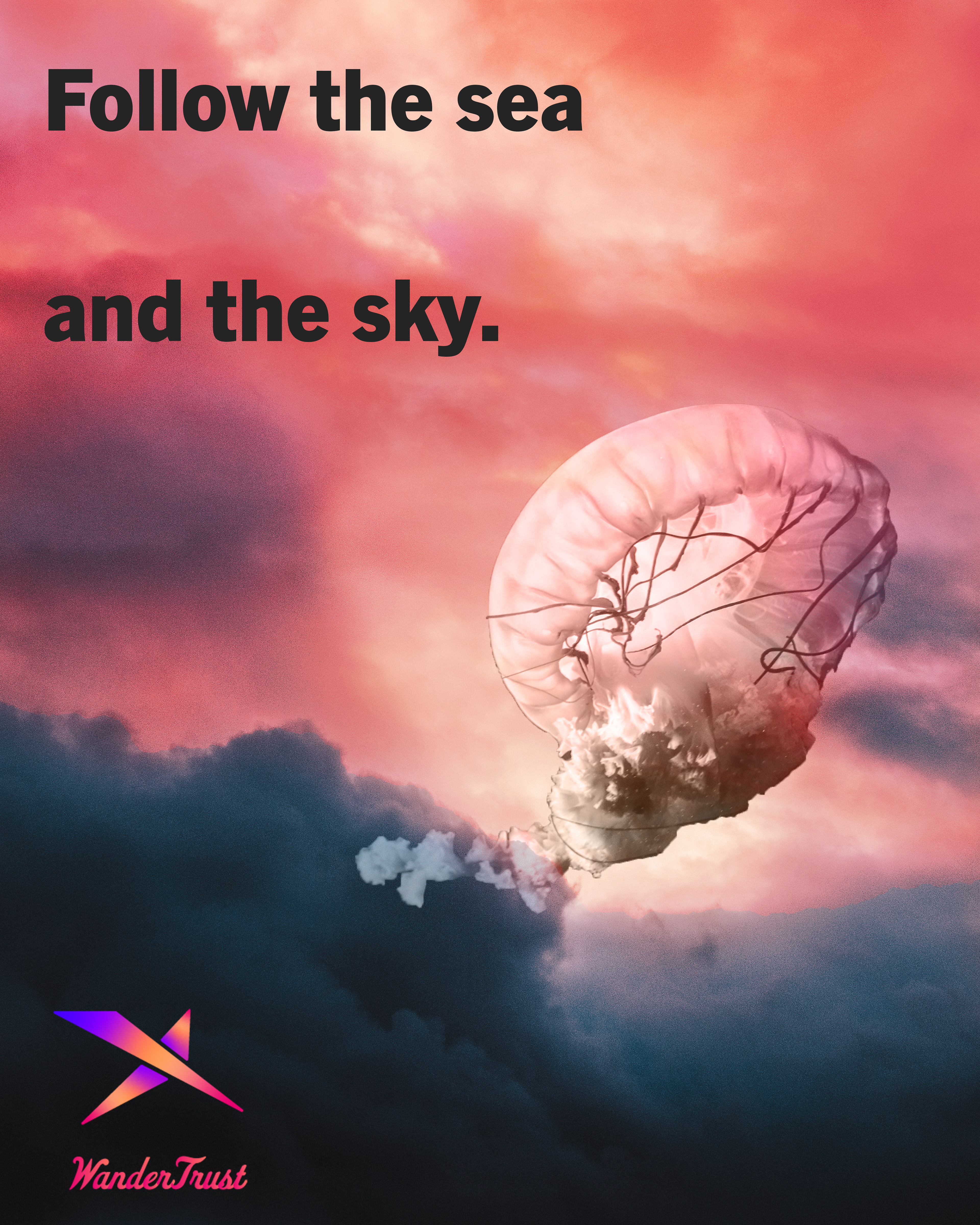
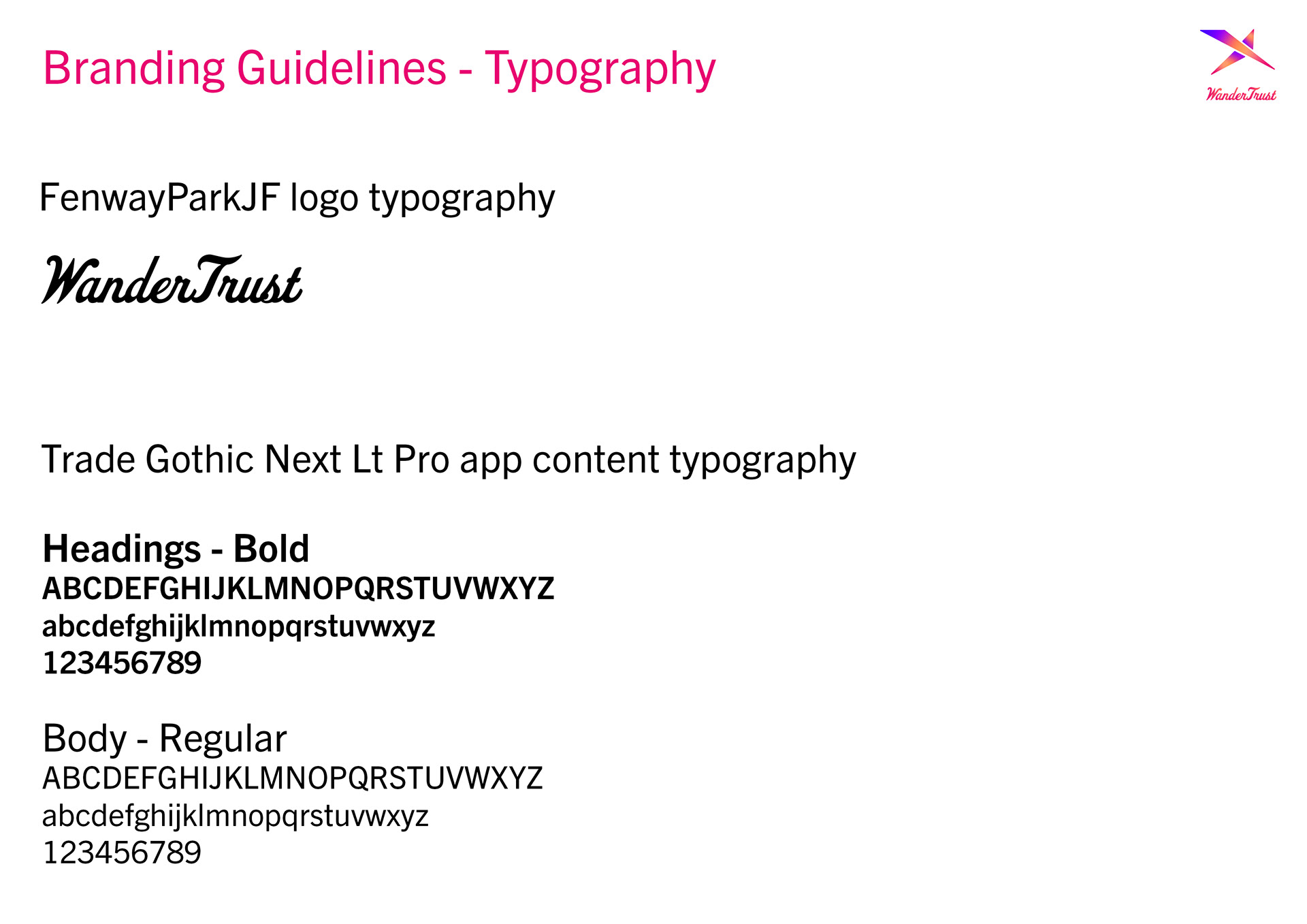
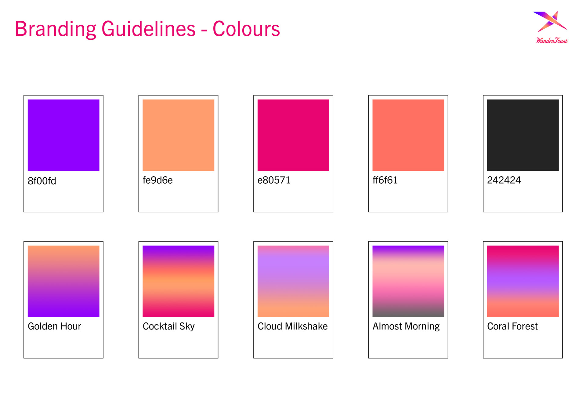
WanderTrust was an opportunity to really play with gradients and warmth. I took the Pantone colour of the year, a coral shade, and built my palette around that.
Our next step was to do user research
Montana created a list of questions related to travel for anyone to answer. We both called out to our friends, family, and followers on Instagram to fill this out. Their feedback was extremely valuable to us, it really helped us understand what people needed from a travel app, and the difficulties they currently faced.
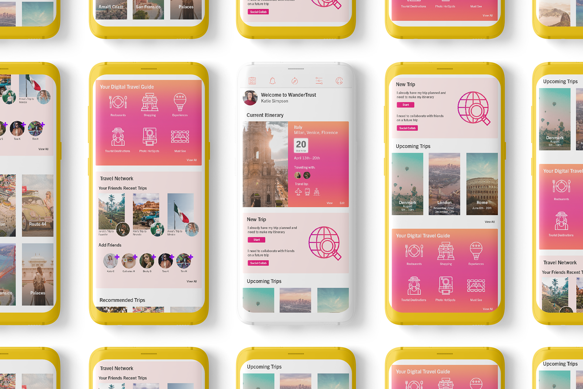
Once our research was done we created mock ups using Figma
I created the mocks for the homepage and itinerary while Montana did the login and onboarding
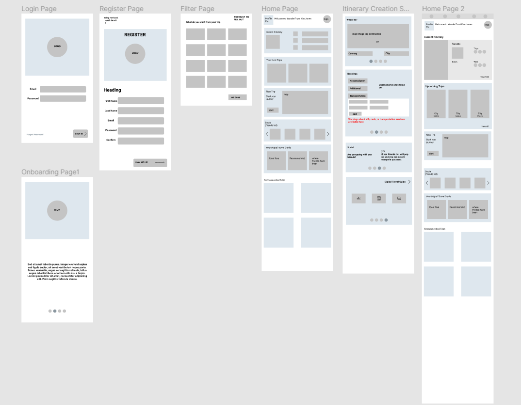
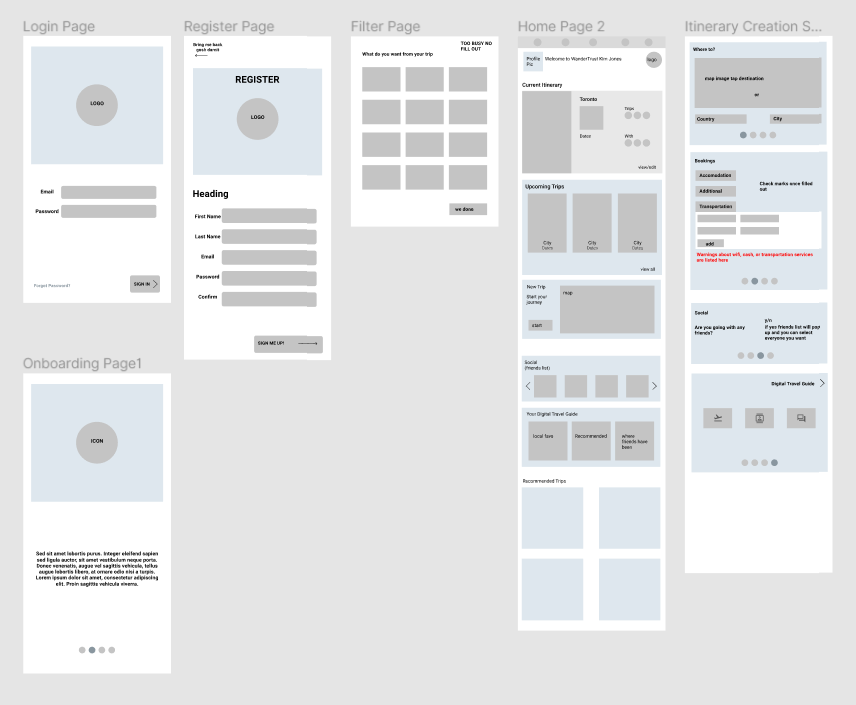
The homepage was simplified to include more imagery and only the necessities
Feedback from a UX professor was that our app had to be simpler and be able to make a user come back. Since then we implemented more user featured ideas and simplified the experience to be more user friendly.